 Leading Lines: I think this is was a pretty easy picture to take. To me personally, this picture is okay. It bothers me that one part of it looks straight and some places don't. I couldn't get it all completely straight. I like the concept though. I like the lighting and the colors involved.  Converging Parallel Lines:  Horizontal Lines: I like the colors in this picture. I edited it specifically to make it look tinted. I like how it's simple and easy to follow along. I wasn't too hard to come up with. It's a little generic but I think the editing makes it stand out a little more.  Verticle Lines: I really like the colors in this one. This one took a little more thought and looking at things through a photographer's eye to take. I think it represents the concept of verticle lines well though.  Diagonal Lines: I actually really like this picture. I think it's really pretty. I really love how there are two halves of the picture. I like how one is simple and clear and other is complex and colorful. I think it makes this picture a good picture by balancing it out.  Curved Lines: This one was the hardest to take. I really had trouble finding something that had curved lines. Even in this picture, I don't like the lighting.
0 Comments
 I like this photo because it's really plain and simple but kind of pleasing to the eye. Obviously it was pretty hard to take since it's of a toddler. It was hard to get her to stop moving. Also, when I first put her in front of the window, her head barely reached, so I had to put her on top of something to get the full effect. Also, the window has a weird glint on it that I wish wasn't there. I think this photo turned out really well. 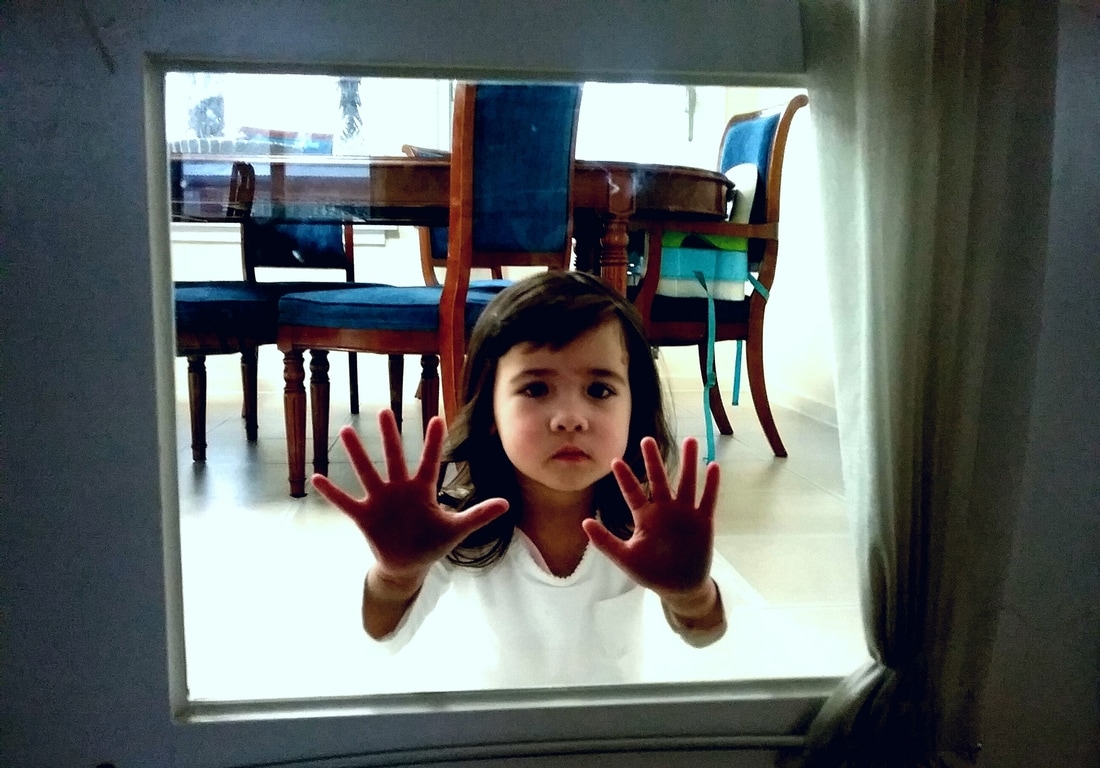 Once again, this photo was really hard to take. She would move or I wouldn't capture the whole frame. It took forever to get the perfect picture where the whole frame was included and the baby was not blurry. I think this photo is a cool concept though. And it shows an example of a picture taken with a frame accurately.  This one was probably the hardest to take. It's not the best I could do probably but I used what I had. For this one, I had to really look at everything through a photographer's eyes. I constantly checked things to see if they were frames. This photo turned out okay. It's not one of my favorites though.
 Photo by: Takashi Nakagawa  Photo by: Elena Bobrova  Photo by: Michael O'brien  Photo by: Mike Sutton Brown  Photo by: Dani Pemperton
 This is a necklace that all the young women at my church have. It's kind of a symbol that stands for us. I didn't really plan out this shot. I kind of just put the necklace down and took multiple pictures and then chose the one that looked the best.  This is a painting my family got in Cuba. I was walking by and looking at it and I thought it would be a perfect shot. It was really dark in my house though I had to edit it.  I think this is a really nice, simple, clear shot that accurately models the compositional theme.  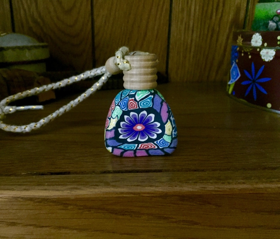 I like the colors in this one too. I think I took this picture just because of the colors. I added the compositional technique in later.
 Leading Lines - Photo by: Joseph Radhik  Converging Parallel Lines - Photo by: Kylie Merriman  Horizontal Lines - Photo by: Octavio Duran  Vertical Lines - Photo by: Machael Greenberg  Diagonal Lines - Photo by: Gaston Piccinetti  Curved Lines - Photo by: Konrad Kulis
 Photo by: Richard Wylie  Photo by: Anton Petris  Photo by: Gary Fua  Photo by: Paul Nicklen  Photo by: Paul Reiffer  Photo by: Erika Hart 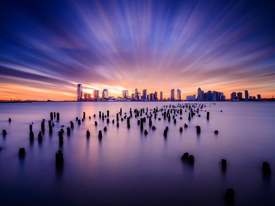 Photo by: Tsuyoshi Shirahama 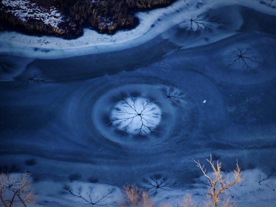 Photo by: Mike Forsberg  Photo by: Thomas Peshak  Photo by: Aleksnadra Turkowska
For this assignment, we were asked to pick three subjects and take two photographs of each. Resulting in six photos in the end. One of the two was required to be of the object in the "third" of the frame and one in the center or just not in the "third." I learned that using the rule of thirds adds depth to your photo. It really adds personality and makes it not just a shot that anyone can take in 2 seconds. Using this rule can be the difference between a hardly worked on photo and a lazy one. Personally, I really like using this composition.
 Photo by: Jodi Cobb  Photo by: Walter Meayers Edwards  Photo by: G. Lecoeur  Photo by: Douglas Gimesy  Photo by: Davide Lopresti  Photo by: Cori Mottice 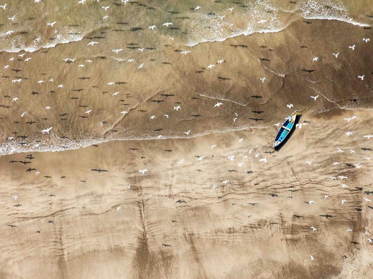 Photo by: Vikus Datta 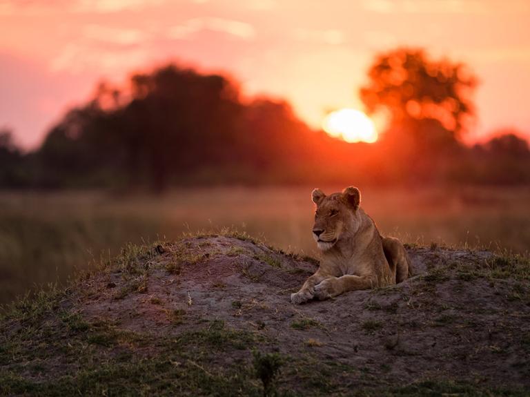 Photo by: Marja Shwartz  Photo by: Manish Mamtani 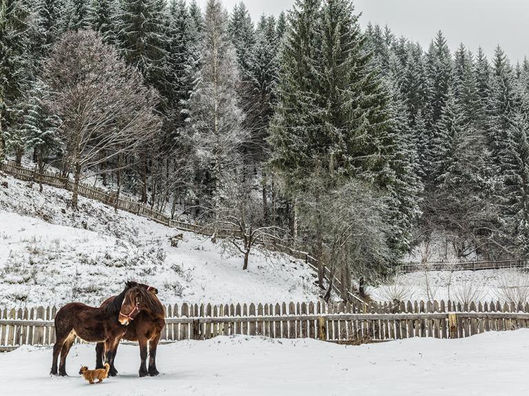 Photo by: Mihaela Jurca
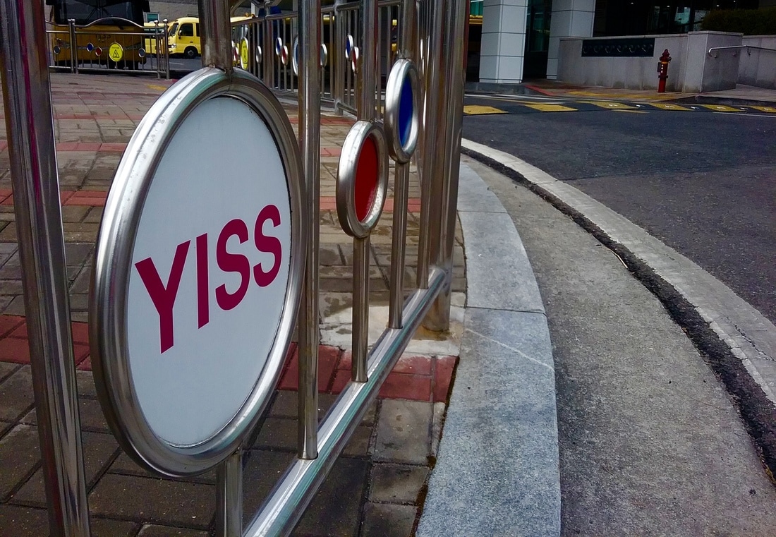 Focal Point: YISS Gate  Focal Point: Cone 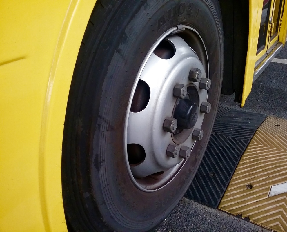 Bus Wheel  Focal Point: Top of the Tree 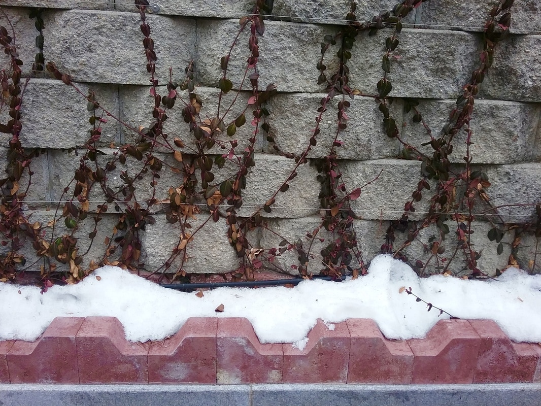 Focal Point: Snow and Bricks 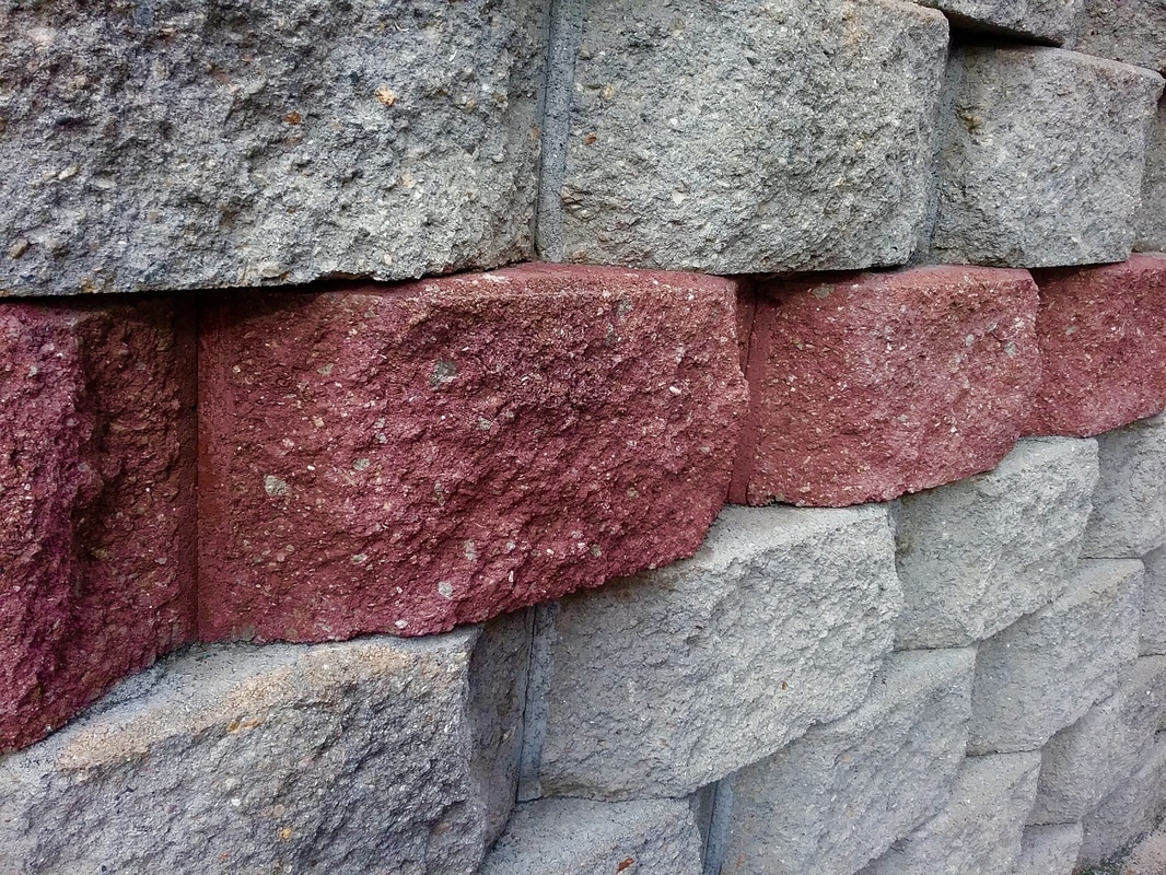 Focal Point: Red Bricks 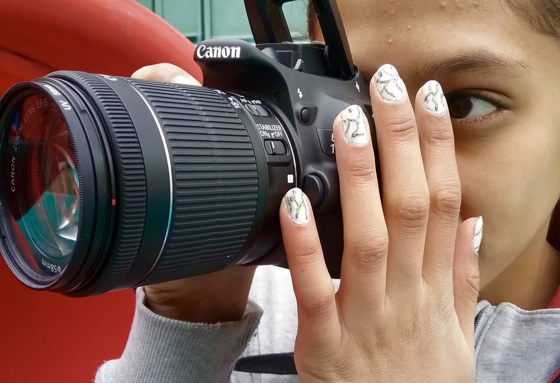 Focal Point: Camera 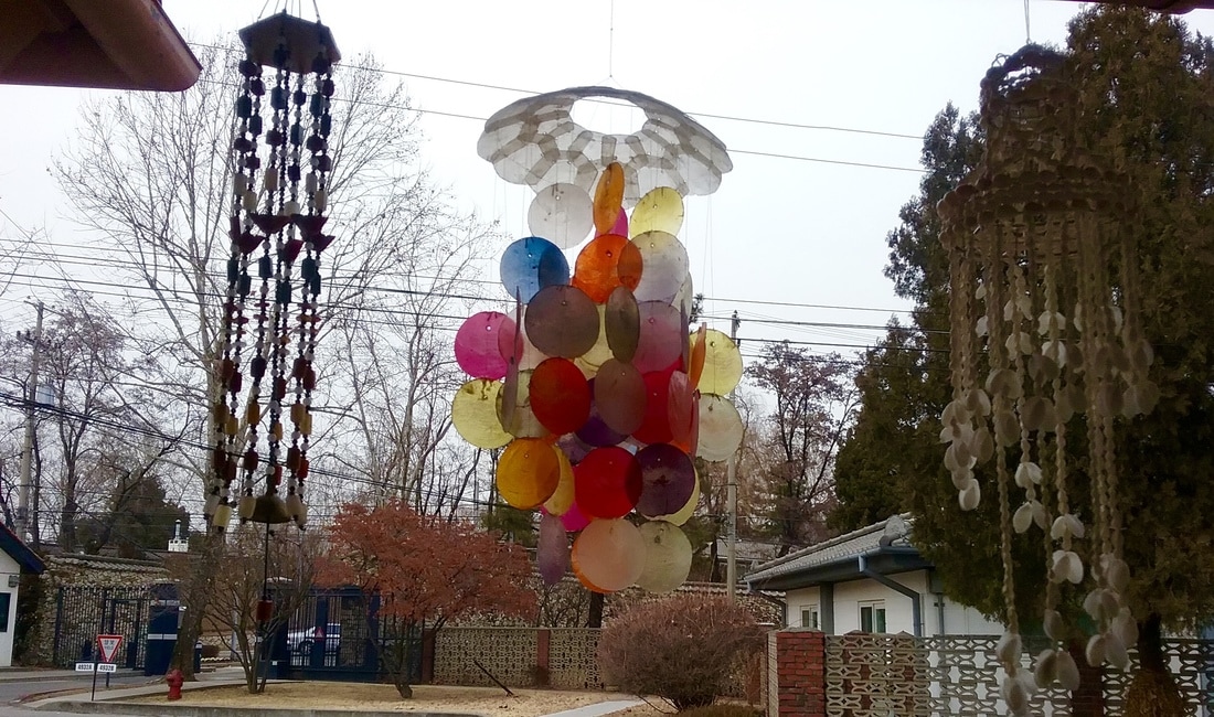 Focal Point: Colorful Wind Chime  Focal Point: Candy Cane in the Middle 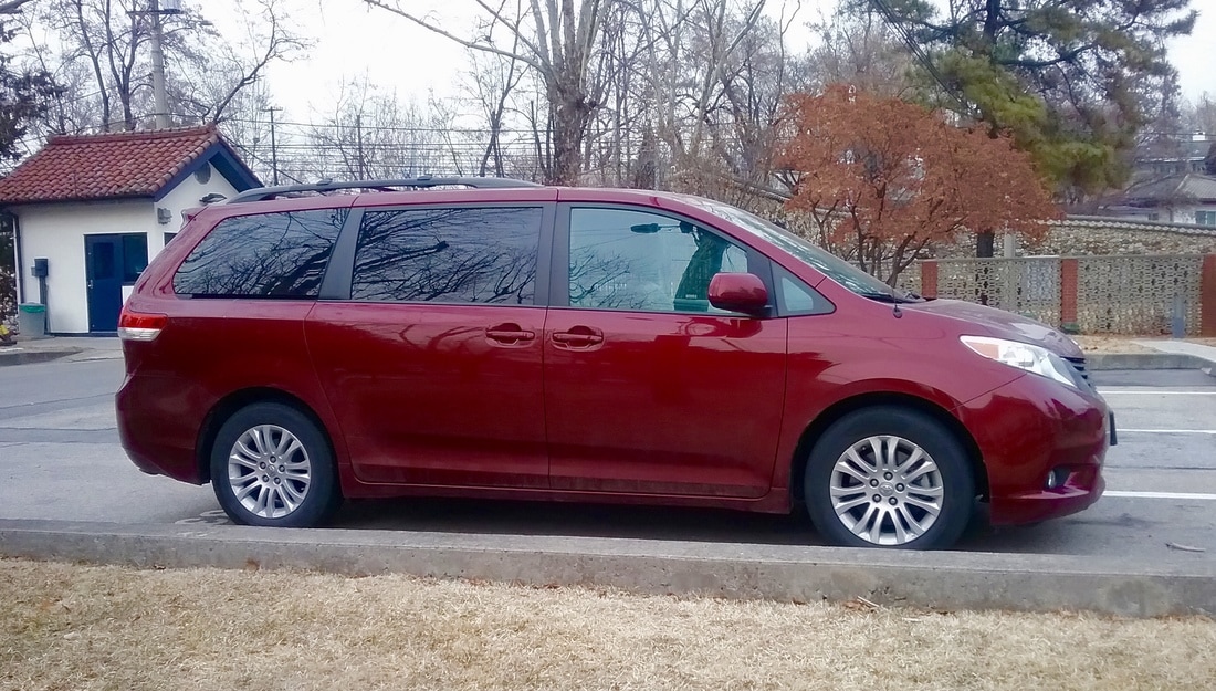 Focal Point: Car 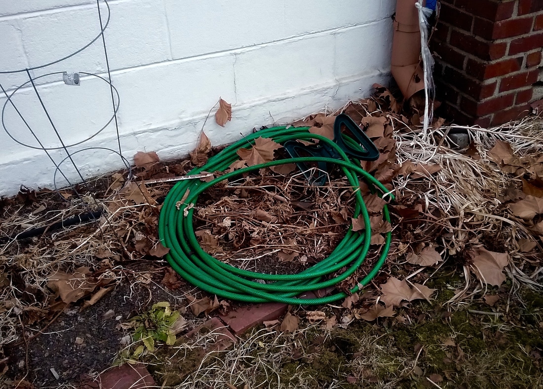 Focal Point: Hose  Focal Point: Birdhouse  Focal Point: Path  Focal Point: Rose in the Middle 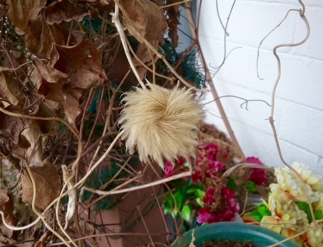 Focal Point: Plant in the Middle
3. To me, when someone says to "fill the frame with what you like," I think they mean to fill the frame with the reason you took the photograph. You want to fill the frame with whatever made you stop what you were doing to take a picture. I think it's important to do this because anyone can just raise a camera to their eyes and snap a super general picture that has a million things going on. But not anyone can take a few steps closer, figure out the best angle and take a well thought-out picture that stands out from everyone else's. You can make sure to fill the frame with what you like by thinking before you take the picture. Specifically, think about the why you're taking a picture and what it is you want your viewer's eye to land on and focus the most on when they first see the picture. 5. When I went out to do a sketch, I didn't think I'd come back a week later. I thought it'd only be around 2 days. But we didn't end up going back outside until the next week. By then, the snow had been played with and half-melted. So I just found the spot that looked the most like my sketch. So I guess no, I didn't capture what I envisioned. But if I had sketched my second spot, I think I would've come out with what I thought I would. I really liked the light in my picture. I like how it falls on the snow and the leaves of the vine. Of course there are many things I could do to improve it, but I think my picture came out pretty well. I one thing I could do to improve it has to to with the angle. I could've come up with a more creative angle. I mean, it's a cool picture, but I think it would stand out a little more if I had taken it from a more unique angle. 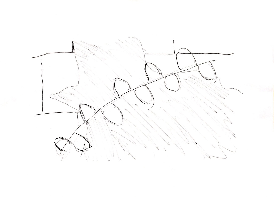  |
AuthorWrite something about yourself. No need to be fancy, just an overview. Archives
May 2017
Categories |


 RSS Feed
